How to Improve OCR Accuracy: 12 Practical Fixes That Actually Work
OCR accuracy is not a fixed property of the software. The same engine can read one image at 99 percent and another at 60 percent, and the difference is almost always the image, not the tool. That is good news, because it means accuracy is something you can control. A few minutes spent on the image — better light, a straighter photo, a higher resolution — is worth more than any setting in the converter, and it is worth more than switching tools.
This guide lists the twelve fixes that actually move the number, in the order that matters, with the reason each one works. They are drawn from how OCR engines really work, not from folklore, and each one is something you can do with the phone and the software you already have. Try them on the image to text converter on the home page — convert an image, note the confidence score, apply a fix, and convert again to see the difference. For the background, see what OCR is and how it works; for the full conversion workflow, see how to convert an image to text.
| Rank | Fix | Typical gain |
|---|---|---|
| 1 | More resolution (300 DPI, fill the frame) | 10–30 points on small text |
| 2 | Straighten the page | 5–15 points on tilted photos |
| 3 | Even, bright light | 5–10 points; removes shadow errors |
| 4 | Maximize contrast | 5–15 points on faded print |
| 5 | Crop tightly to the text | 2–5 points; fixes reading order |
| 6 | Set the right language | 10–20 points on foreign-language pages |
1. Use More Resolution
This is the biggest single factor, and it is the one people most often get wrong. OCR needs the letters to be big enough in pixels: roughly 10 pixels tall per character at the absolute minimum, and 20 to 30 pixels for comfortable accuracy. A page of 12-point text scanned at 300 dots per inch gives letters about 40 pixels tall, which is ideal. The same page photographed at low resolution, or screenshotted at a small size, can give letters under 10 pixels, and at that size the engine is guessing.
The rule is simple: aim for 300 DPI when you scan, and fill the frame when you photograph. A phone photo of a full page taken from arm's length is usually fine on a modern phone, because the sensor is large. A photo taken from across the room is not, because the page is a small part of the frame and the text is tiny. Walk closer. It is the cheapest accuracy improvement there is.
Do not upscale a low-resolution image and expect it to help. Enlarging an image in an editor does not add detail; it just makes the same blurry pixels bigger. The detail has to be in the original capture. If the only copy you have is low resolution, the honest answer is to re-capture it at higher resolution, or accept the lower accuracy and proofread more carefully.
2. Straighten the Page
Skew — the page tilted a few degrees — is the second biggest factor, and it is the easiest to fix. OCR engines assume text runs horizontally. A page tilted by 5 degrees is readable but worse; a page tilted by 15 degrees can be unreadable, because the lines slope across each other and the engine cannot tell where one line ends and the next begins. The letter shapes themselves are distorted by perspective as well: a page photographed at an angle is narrower at the top than the bottom, and the letters change shape across the page.
Most phone camera apps now detect document edges and straighten the shot automatically — use that feature when it is offered. If you are scanning, feed the page straight and check that it did not shift in the feeder. If you are photographing, hold the phone parallel to the page, not at an angle. And if the image you already have is skewed, rotate it in a photo app before uploading: a rotation of a few degrees is a thirty-second fix that can recover ten accuracy points.
3. Use Even, Bright Light
Shadows are the enemy. A shadow across half a page creates a sharp edge the software can mistake for a feature, and the text inside the shadow reads worse than the text outside it, because the contrast is lower. The same applies to glare: a bright spot from a flash or a window reflection washes out the text underneath it, and the washed-out area reads as blank.
Photograph near a window in daylight, with the light coming from the side rather than from behind you, so your shadow does not fall on the page. Avoid the phone's flash, which creates a bright spot in the middle and dark corners. If you are indoors, use two lights from different directions rather than one strong light from one side. And if the page is glossy — a magazine, a laminated card — angle the phone slightly to avoid the reflection, or photograph it in shade rather than direct sun.
4. Maximize Contrast
OCR works by deciding, for each pixel, whether it is ink or background. High contrast makes that decision easy: black text on white paper is the ideal. Low contrast makes it hard: pale grey text on white, yellow highlighter over print, pencil on cream paper, or a faded receipt all leave the software guessing where the letters end.
If the contrast is low, increase it before uploading. Most phone photo apps have a one-tap "enhance" or "document" mode that boosts contrast and brightens the background. A photo editor's contrast slider does the same thing. For a faded document, converting to pure black and white — not greyscale, but a hard threshold where every pixel becomes black or white — can rescue a page that reads as blank in color. Be careful with this: too aggressive a threshold erases thin strokes, so check the result by eye before you upload it.
5. Crop Out Everything That Is Not Text
Layout analysis — the stage where the software decides what order to read things in — is easily confused by clutter. Borders, desk surfaces, fingers holding the page, the next page peeking in from the side, a coffee cup in the corner: all of them are features the software has to explain, and they can pull the reading order apart. A tight crop around the text block is worth thirty seconds, and it pays for itself in accuracy.
Crop to a single column when the page has two columns, or a sidebar. A two-column page read straight across mixes the sentences from both columns together, and the result is unreadable even though every word is correct. Converting each column separately is the reliable fix, and it is faster than untangling the mixed text afterwards.
6. Pick the Right Format
Format matters, but less than the five fixes above. PNG is lossless and preserves sharp edges, so it is the best choice for screenshots and scans of small text. JPG is lossy and softens edges slightly, which costs a little accuracy on small print but is fine for large text. The PNG to text guide and the JPG to text guide cover the trade-off in detail.
The important rule is not to convert formats hoping for a gain. A JPG converted to PNG does not get sharper, because the detail was already lost. And a PNG saved as a low-quality JPG gets worse. Use the format the image was created in, and save new scans as PNG when you have the choice.
7. Set the Language Correctly
This is the cheapest fix of all, and the most commonly missed. Running the English model on a Spanish page, or the Spanish model on a French page, can cost twenty accuracy points or more, because the language model corrects real words into nonsense. Set the language to match the page before you convert. For pages that mix two languages, use the mixed mode where one exists, or convert twice with different settings and take the best of each. The guide on multi-language OCR explains the trade-offs.
8. Clean the Image, Gently
A little image cleaning helps; a lot hurts. Removing speckles and noise — the stray dark pixels from a dirty scanner bed, or the grain in a low-light photo — helps the engine, because it stops mistaking noise for punctuation. Most scanning software has a "despeckle" option, and it is worth turning on for old or dirty scans.
But do not over-clean. Aggressive noise removal erases the dots over "i" and "j", and the thin strokes of small letters. Aggressive sharpening creates halos around letters that the engine reads as extra strokes. And binarization — forcing every pixel to black or white — can erase pale text entirely. The rule is to clean lightly, check the result by eye, and stop when the text looks clean to you. If the cleaned image looks worse to your eye, it will read worse to the software.
9. Split Long Pages and Batches
A very tall image — a scrolling screenshot, a long receipt, a full newspaper page shrunk to fit — squeezes the text small, and small text reads badly. Split long images into sections at full size, and convert the sections as a batch. Each section reads at full accuracy, and the overlap between sections lets you find the joins.
The same logic applies to batches. Do not convert a hundred pages and then proofread them in order. Proofread by confidence: the CSV report that comes with each batch lists every page with its mean confidence, so sort by confidence and start with the lowest-scoring pages. Those are the ones with errors. The pages above 90 percent usually need only a skim. This triage is the difference between a batch job that takes twenty minutes and one that takes two hours.
10. Use the Confidence Report
A confidence report does not improve the OCR, but it improves the result, because it tells you where to look. On SnapText, every page shows a mean confidence percentage, and every word below 60 percent confidence is listed. Proofread in this order: flagged words first, then numbers, then names. Numbers are the characters OCR confuses most, and a wrong number in a total or a date is the error with consequences. Names are the words the language model cannot correct, because they are not in the dictionary, so a misread surname sails through unnoticed unless you check it.
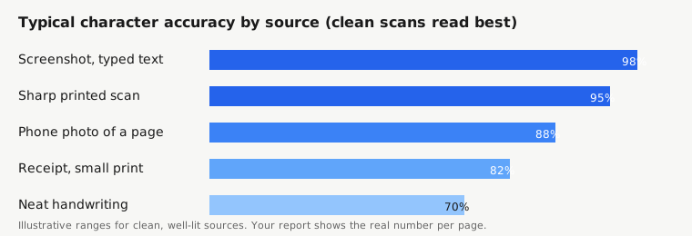
If the mean confidence is above 90 percent, a light skim is enough. If it is between 70 and 90, read the page carefully. If it is below 70, read it line by line. And if it is below 40, the page was probably re-read by the vision model already on a paid plan, and you should treat the whole result as a draft. The number is honest, and it is there to be used.
11. Know When to Use the Vision-Model Re-Read
On paid plans, SnapText re-reads a page with a vision model when Tesseract returns fewer than 20 characters or under 40 percent mean confidence. That re-read often saves pages that would otherwise come back empty — a blurry photo, a decorative font, a page where the text wraps around a picture. Vision models look at the whole word and the whole line, instead of cutting characters apart, so they cope better with the hard cases.
But the re-read is not magic. It is slower and more expensive to run, which is why it only triggers on pages that need it, and it can produce a confident-sounding wrong word where Tesseract produced an obviously uncertain one. A wrong word delivered confidently is more dangerous than a wrong word flagged as uncertain, because you are less likely to check it. Treat a re-read result the same way as any other: proofread it against the original, and trust the image over the text whenever they disagree.
12. Fix the Source, Not the Output
The last fix is a habit, not a setting. When a page converts badly, the instinct is to fix the text by hand — and for one page, that is sometimes right. But for a batch, or for a page you will convert again, fixing the image is almost always faster. Re-photograph the page in better light, straight on, closer up. Re-scan it at 300 DPI instead of 150. Flatten the receipt, wipe the scanner glass, close the lid properly. A new capture takes a minute; fixing a bad transcription takes ten.
This is also the right habit for repeat work. If you convert receipts every week, set up a small routine: same spot by the window, same phone, same distance, receipts flattened under a book first. The routine takes no extra time once it is a habit, and the accuracy gain is permanent. The same applies to scanning: clean the glass, feed pages straight, save as PNG at 300 DPI, and the results will be consistently good instead of randomly bad.
What Does Not Help
A few popular suggestions do not actually help, and it is worth knowing which ones to skip. Upscaling a low-resolution image does not add detail. Converting a JPG to PNG does not restore lost sharpness. Running the same image through three different OCR tools and picking the best result per page can help on a single hard page, but it is not a workflow for a batch. And "AI enhancement" apps that promise to deblur a photo usually sharpen the noise as well as the text, which can make the result worse. Spend the effort on the capture, not on the processing.
The Short Version
OCR accuracy is mostly decided by the image: resolution, straightness, light, contrast, and cropping matter more than the tool or the settings. Set the language correctly, crop tightly, proofread by confidence — flagged words first, then numbers, then names — and use the vision-model re-read for the pages where the first pass collapses. When a page converts badly, fix the image and convert again; that is almost always faster than fixing the text by hand. And keep the habit: a good capture routine pays for itself every time you convert.
References
- Tesseract OCR, official documentation: https://tesseract-ocr.github.io/
- National Institute of Standards and Technology (NIST), document recognition research: https://www.nist.gov/
- Library of Congress, Digitization and OCR: https://www.loc.gov/
- U.S. National Archives, Digitization programs: https://www.archives.gov/
- W3C Web Accessibility Initiative, guidance on text alternatives: https://www.w3.org/WAI/